Transform your online presence with responsive web design
Make a lasting impression on every device. We craft stunning, high-converting websites that look flawless, everywhere. Boost your brand, drive traffic, and skyrocket sales with our responsive web design.
What is included in our responsive web design services?
Grab attention, not scrolls. Our responsive web design makes your site shine on any screen. Experience seamless browsing, increased conversions, and leave a lasting impression on your visitors so they can’t help but come back for more.
Your website deserves a standing ovation on every device. Our tailored responsive designs boost engagement and skyrocket conversions on desktop, mobile, and tablet. Let’s create a digital experience that wows every time, no matter what.
Responsive web design services
Our responsive web design experts will transform your website’s performance, improve user experience, and keep seamless functionality across all devices.
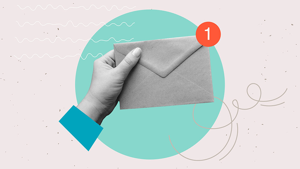
Book a call with one of our web design experts today. We’ll talk about what you need and figure out the best way to get you results. No fluff, just honest, effective solutions that actually make a difference. Let’s get your brand the recognition it deserves.
We begin by understanding your business goals, target audience, and current website performance. Our team does a thorough analysis to identify opportunities for improving your site’s responsiveness straight away.
Stage 2
Customised design & development
We create a tailored responsive web design strategy, focusing on fluid grid layouts, flexible images, and cross-browser compatibility. Our design ensures your website looks stunning and functions seamlessly across all devices.
Stage 3
Implementation & continuous optimisation
We implement the responsive design and rigorously test it on various devices and browsers. Post-launch, we continuously monitor and optimise your website’s performance to ensure it remains up-to-date and responsive to evolving user needs.
Transform your business with responsive web design
From mobile optimisation to user experience enhancements, we provide everything you need to make your website a success.
We design and develop custom responsive themes that ensure your website looks stunning and functions perfectly on all devices, from desktops to smartphones.
Mobile optimisation
Our mobile optimisation techniques guarantee fast load times and smooth navigation on mobile devices, providing an excellent user experience for on-the-go audiences.
User experience enhancements
We focus on transforming the user experience by creating intuitive navigation, clear calls-to-action, and engaging content that keeps visitors on your site longer.
Our team makes sure images and media elements are optimised and displayed correctly on all screen sizes, keeping your website looking it’s best.
Cross-browser compatibility
We test your website across various browsers to ensure it works seamlessly for all users, regardless of their preferred browser.
Performance monitoring and optimisation
We continuously monitor your website’s performance and make necessary adjustments to improve speed, functionality, and overall user experience.
Detailed reporting and analysis
Our detailed reports provide insights into your website’s performance, helping you understand user behaviour and identify areas for improvement. We make data-driven recommendations to keep your website at its best.
Responsive web design is an approach to web development that ensures your website looks and functions well on all devices, including desktops, tablets, and smartphones. It adjusts the layout and content to fit different screen sizes, providing the very best user experience.
Why is responsive web design important?
Responsive web design is important because it boosts user experience, improves website performance, and keeps your site accessible on any device. This can lead to higher engagement, better search engine rankings, and increased conversions. All great things for a business like yours.
How does responsive web design differ from mobile-friendly design?
While both responsive and mobile-friendly designs aim to improve usability on mobile devices, responsive design adapts the layout to fit any screen size dynamically. Mobile-friendly design, on the other hand, ensures the site functions well on mobile devices but may not fully adjust for different screen sizes.
What services are included in your responsive web design package?
Our responsive web design package includes:
Mobile-friendly design
Fluid grid layouts
Flexible images and media
Cross-browser compatibility
Intuitive navigation
Fast loading times
Ongoing maintenance and support
How long does it take to create a responsive website?
The timeline for creating a responsive website depends on the complexity of the project and your specific requirements. Generally, it can take anywhere from a few weeks to a few months. We will provide a detailed timeline after our initial consultation.
Will a responsive design affect my current website content?
No, a responsive design will not affect your current website content. Instead, it will optimise the way your content is displayed across different devices, making sure it looks great and is easy to navigate on any screen size.
Can you convert my existing website to a responsive design?
Yes, we can convert your existing website to a responsive design. Our team will analyse your current site and develop a strategy to transform it into a fully responsive, user-friendly experience.
How do you ensure my website will look good on all devices?
We use a combination of fluid grid layouts, flexible images, and thorough testing on various devices and browsers to ensure your website looks and functions perfectly on all screen sizes.
Do you offer ongoing support after the responsive design is implemented?
Yes, we offer ongoing maintenance and support to ensure your website continues to perform optimally. This includes regular updates, performance monitoring, and adjustments as needed to keep your site up-to-date and responsive.
How will a responsive design impact my search engine rankings?
Responsive design can make a great impact on your search engine rankings. Search engines like Google prioritise mobile-friendly and responsive websites, leading to improved visibility and higher rankings in search results.
What They Say:
You guys absolutely smashed it out of the park and your suggestions were fully in line with where we wanted to go with this, hence why it was such an easy and quick decision to make.
Ian Hajyzamanali
We can’t believe that an agency has got this involved with our P/L and helped us build our FY25 forecast.
We are so happy we moved to Own Your Space!
Clint G
Own Your Space has been an instrumental part of our growth in the last 12 months. Marketing is an essential cornerstone of any business and having the right partner gives us the security to keep reinvesting in our growth as we know the results will be there to back it up.
We have a great relationship with all of the team, the depth and understanding they have of our business is so important to us.
Gordon Wallis
It's been awesome to work with the team at Own Your Space over the last 18 months. Our company can safely rely on them to make the right decision on continuing to push our ROI as we expand across Canada.
Joshua Harris
Great communication, very helpful and offer a great service. Highly recommended 👌
Nicola Entwistle
They created a new website for us, which has increased traffic to our website significantly. They don't hassle us and we have regular meetings to review progress.


